
Letter from the designer
Hi. Cody Jensen here. These graphic standards are over a decade in making. In 2009, I created the first City Church logo in the middle of a staff meeting as we discussed the vision and future of the church. This set City Church’s tone and branding for the next 10 years. In 2020, after a four-year soul-searching journey from coast to coast, God brought me back to City Church with a new vision.
I witnessed the true transcendent power of art. The aesthetic philosophy of simplicity and excellence carried out to scale, confirming and deepening my natural instincts. I consumed fine art, street art, architecture, performance, and tuned my eyes to the beauty of all things as we co-create with the Creator of the Universe to bring about the garden city of the future.
I take form, beauty, excellence, and art as seriously as I take my faith because they are inseparable. I am called to be an Artist and a Maker and if you are reading this I challenge you to join me in finding no line meaningless, no word trivial, no color or shape or image without considered thought.
A simple guideline for how to think about our brand: City Church is not a business. We are a cultural institution. We don’t take inspiration or guidance from the business world, entrenched in a visual standard built on a foundation of market manipulation for its own gain. We don’t take inspiration from churches that build their identities on the foundations of business philosophies. City Church is instead a cultural and civic institution. We take inspiration and visual guidance from the non-profit world of charities, museums, libraries, schools, civic and public institutions, and arts and culture organizations.
Thank you for referencing this guide as you carry out the voice of City Church. If you can’t find what you
are looking for in this document or need additional assistance please email design@citychurchtulsa.com.
Grace and peace,
WHAT IS A BRAND
City Church Tulsa
What is a brand?
It’s words.
It’s images.
It’s experiences.
Ultimately, a brand is a gut feeling. As City Church grows, it is of the utmost importance that our media, art, and communication create impressions that draw people into the church and, ultimately, a relationship with Christ.
These guidelines are not just a bunch of rules. They are a set of principles and standards that help our staff, volunteers, and contractors communicate our mission clearly and consistently.
WORDMARK
City Church Tulsa
Our Wordmark
The City Church logo is simple.
The words City and Church in title case, stacked,
left-justified and perfectly kerned in a sans serif font called GT America Bold designed by Grilli Type.
Our design philosophy is great design is not complete when there is nothing left to add but when there is nothing left to take away.
The City Church identity is a seal of approval and a promise of excellence. You represent City Church
every time you use the brand.
Whether seen on screen, in print, or on apparel, the logo is stable and unchanging. The identity can only make a positive impact if used consistently
and correctly.
LOGOMARK
City Church Tulsa
Our Logomark
At City Church, our logomark is more than just a design; it’s a visual theology that communicates our core beliefs.
Crafted as an abstracted orthodox cross, the symbol honors ancient Christian traditions while addressing contemporary spirituality. The cross is composed of seven dots in 5 colors, each serving as a deliberate representation of our five Kingdom foundations:
Gospel, Identity, Community, Mission, and
Spirit-empowered.
The central pink dot symbolizes the Gospel, the heartbeat of our faith, placed at the heart of Christ.
Flanking the vertical axis are the arms of Christ: the right arm, green for Identity, reaches toward Saint Dismas; the left, blue for Mission, extends to the Impenitent Thief. These embody the dual calls of Christ to personal transformation and outreach.
The three yellow dots that form the head and body signify Community, reminding us of the Trinitarian community of Love that we know as God.
Finally, the footstool of Christ is red, marking our Spirit-empowered journey as believers. Together, these elements form a narrative of faith, inviting all to explore and partake in our community’s shared values.

WORDMARK SPACING
City Church Tulsa
Wordmark Spacing
The City Church logo doesn’t have many size requirements. Being a vector file, it can scale very large or small without losing any quality. It will work well from anything like business cards all the way to large scale banners and signage.
How small can the logo be?
Our logo needs to be legible at all times. If it is sized too small, the shapes and negative space will blend together. For this reason, we require the logo to be at
least ½” wide.
Clear space
In order to make sure the logo is always legible and noticeable, allow clear space around the perimeter of the logo of the logo that is, at a minimum, the size of
the “C” in City Church.

WORDMARK + LOGOMARK SPACING
City Church Tulsa
Wordmark and Logomark spacing
When using the wordmark and logomark together, the logomark is always placed on the right side. The spacing between them is determined dynamically, ensuring that the logomark’s right margin is equal to the wordmark’s left margin. This maintains visual balance and consistency across all applications.

WORDMARK MISUSE
City Church Tulsa
Wordmark Misuse
There are many ways that the wordmark can be used incorrectly. This can cause confusion and weaken the City Church brand. Here are a few examples of how not to use the logo:

LOGOMARK MISUSE
City Church Tulsa
Logomark Misuse
There are many ways that the logomark can be used incorrectly. This can cause confusion and weaken the City Church brand. Here are a few examples of how not to use the logo:

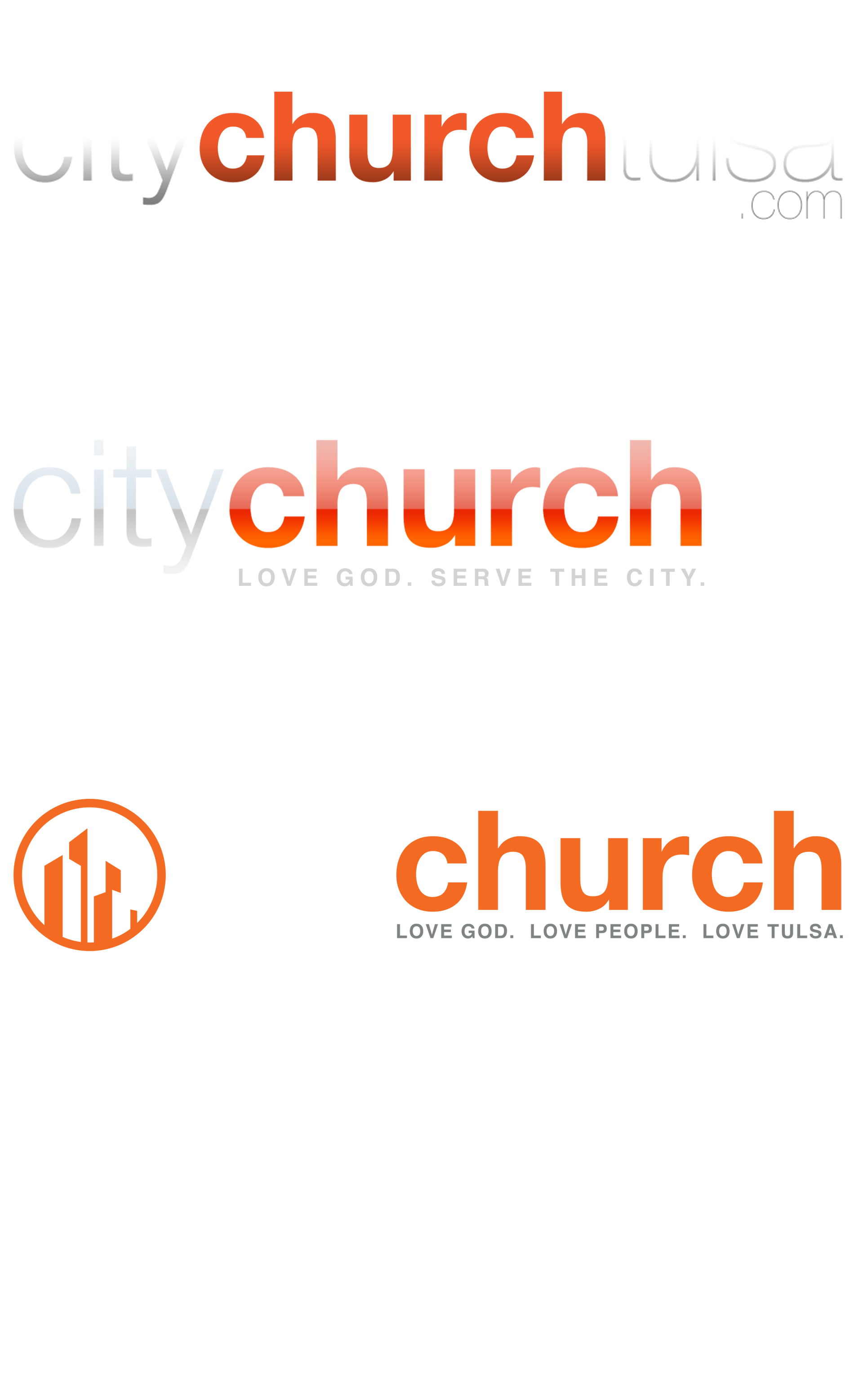
PHASED OUT LOGOS
City Church Tulsa
Phased Out Logos
All legacy (pre-2020) City Church design assets/material should be replaced with our new brand standards.
COLORS
City Church Tulsa
Brand Colors
Colors are just as important as the logo mark itself. Colors convey emotion and a feeling that words cannot provide. These colors have been specifically chosen for City to support everything you do. These colors provide stability and a sense of fun to our brand.
True Black and True White should be used in most situations with black as the background and white as text (think night mode).
A more energetic deployment of color can be introduced when needed to deliver spirit and character.
A full spectrum color palette portrays the church’s energy and vibrancy, expresses the diversity of humanity, and represents our five kingdom foundations. The colors are used in unexpected combinations that give City Church a bright and vivid presence.

FONTS
City Church Tulsa
Typography
Typography is a vital part of the City Church brand. We care deeply about type—the way letters live and breathe on a page or screen. Our two font families, GT America and GT Super, are used in both a subjective and systematized way to create clarity, warmth, and balance.
When our design remains simple, the details matter more than ever. We hold a high standard for margins, kerning, tracking, and leading—because excellence in the small things reflects the spirit of everything we do.
If you need access to the brand fonts, please email Cody.
GT America
GT America Light
GT America Regular
GT America Medium
GT America Bold
GT America Black
GT Super
GT Super Light
GT Super Regular
GT Super Bold
GT Super Super
CITY KIDS LOGO
City Church Tulsa
City Kids Logo
The City Kids logo was created to remain cohesive with all City Church material, but have a unique, youthful appearance. The text can be any approved color as well as the border. The logo can also be the same color as the background behind the border.
All ministry rules apply to the City Kids logo.


CITY KIDS BRAND ELEMENTS
City Church Tulsa
City Kids Brand Elements
Greenery and flowers have been created for City Kids to connect the art being used throughout the church to a younger audience. These shapes are vector files, they can be used in any way and approved colors.
These brand elements can only be used for City Kids and no other ministry.

CITY MIX BRAND ELEMENTS
City Church Tulsa
City Mix Logo & Brand Elements
City Mix is our middle school ministry. It bridges between kids and youth. City Mix visuals move into a hand sketched look. Before moving into the Youth graffiti look.


CITY KIDS LOGO
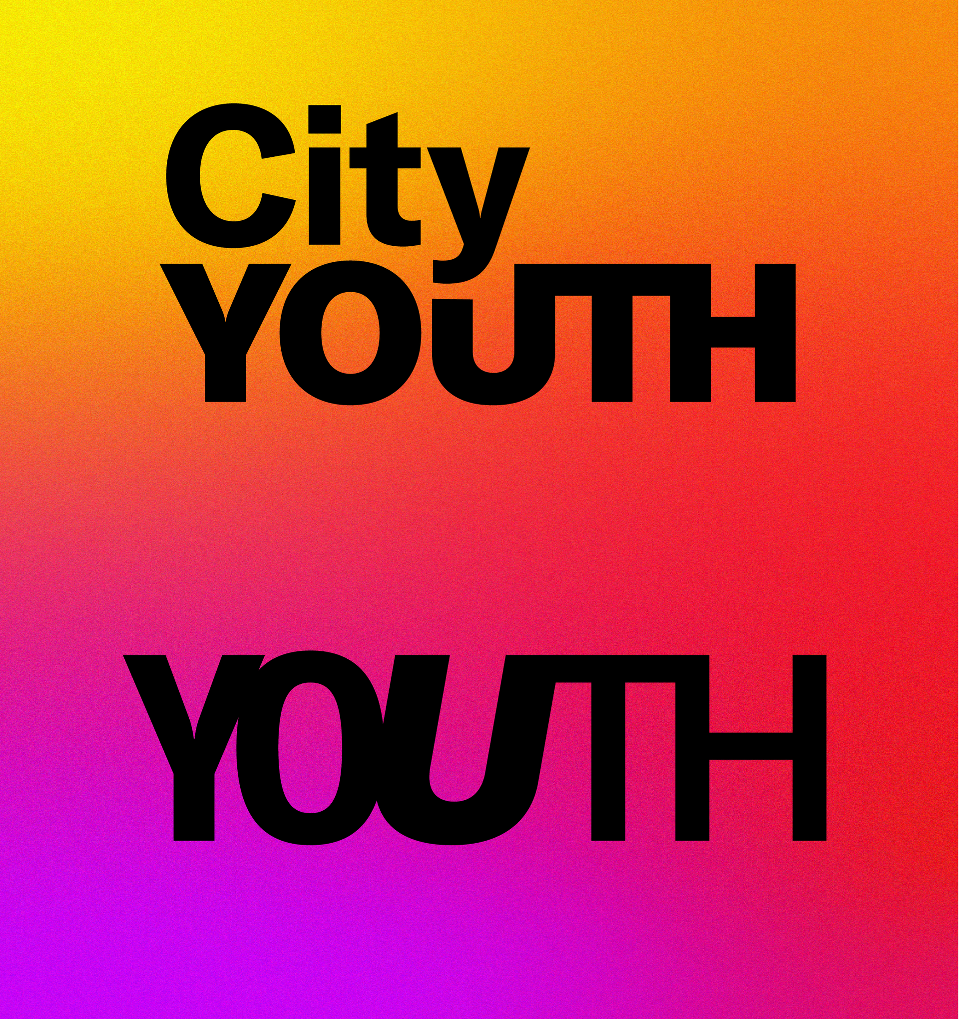
City Church Tulsa
City Youth Logo
The City Kids logo was created to remain cohesive with all City Church material, but have a unique, youthful appearance. The text can be any approved color as well as the border. The logo can also be the same color as the background behind the border.
All ministry rules apply to the City Kids logo.
CITY MIX BRAND ELEMENTS
City Church Tulsa
City Youth Brand Elements
Youth design elements move from notebook sketches of City Mix to street art graffiti style.

DOWNLOADS
City Church Tulsa
Downloads
WEBSITE BUILT BY MAISEY.CO